Wednesday, March 23rd, 2022 by Robert Rocha
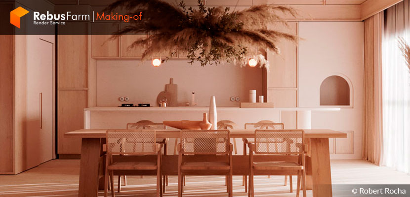
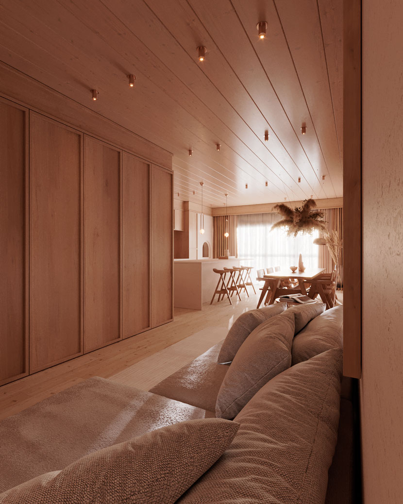
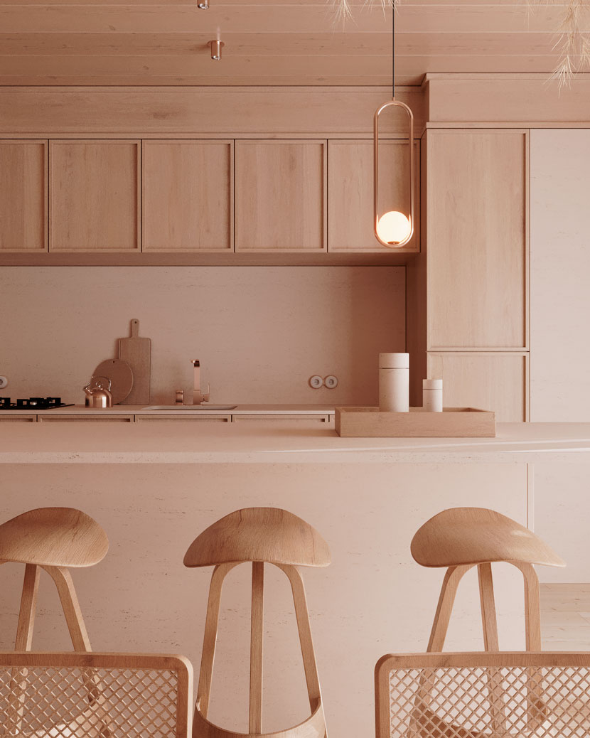
Robert Rocha, a student of Ander Alencar's 'Oficina 3D Training' course, talks to us about his work on a minimalist apartment project called 'Living Neutral Palette'. With the use of simple spaces and minimalist decoration, he uses wood, travertine, and exemplary use of exterior light to create a beautiful and warm atmosphere.
Let's get some tips from Robert himself.
First of all, I want to thank the Rebusfarm team for the invitation, I am very happy and flattered to be able to somehow contribute to this community of such talented artists.
My name is Robert Rocha, I graduated in Product Design after 5 years of studying, and then 1 year ago I discovered the 3D universe and fell completely in love. In 2021 I had the opportunity to join one of the classes of the 'Oficina 3D Training course', taught by 3D Artist Ander Alencar. This is where my first interaction with this universe was, before the course I didn't know anything about 3D. Every day I'm learning more and more about how to get even more realistic results on 3D images for Archviz.
About the scene
It was one of the projects in floor plan that is available in the course 'Oficina 3D Training' for each student to do their modeling and all the project stages. Having, at the end, their images with their own identity and applying what is taught in the course. In this project, I used 3ds Max together with Corona Renderer.
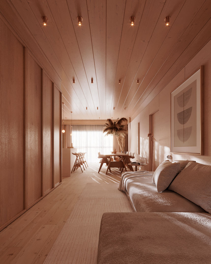 Living room rendered with 3dsMax and Corona Renderer.
About the creative process for this project, I had in mind to make a scene that had a color palette of neutral tones coming to brown, as it is a palette that appeals to most of the audience. Knowing this, I sought to make a semantic panel with references to materials and scenes with this palette, I came to the decision to work with two main materials: wood and travertine. It is essential at the beginning of any scene to have references, so the project can be forwarded and funneled by images and projects that exist, always trying to reach the realism of light and textures of the real world.
Then I made pre-defined lighting with the sun almost reaching the Golden hour, so I would have more dragged shadows, as I wanted. An extremely important point is to make the hierarchy of lights, in this scene what is most illuminating the environment is the sunlight, the artificial lights are very weak, just to give a warmer mood to the scene.
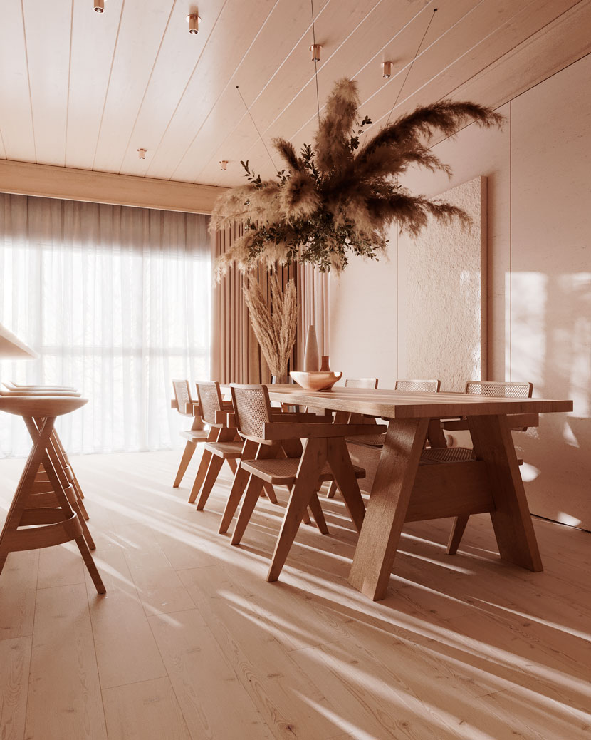 Warm scene based on sunlight.
An interesting tip is that the bigger your light source and the low intensity, the blurrier the shadows will be, if the artist wants more dragged and defined shadows, he needs to work with a smaller light source and with greater intensity.
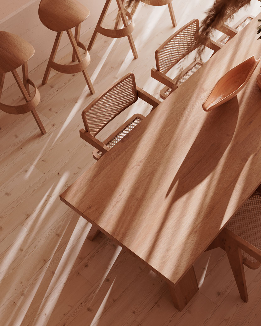 Shadows created with lighting specifications.
Lighting is one of the pillars for realistic images, if it's not good, the whole scene is extremely damaged. Based on the references, I worked each environment with a more minimalist decoration, later I made a semantic panel of camera angles that I found interesting for small environments.
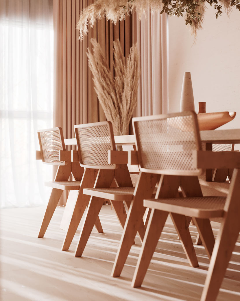 Minimalistic decorations for small environments.
Based on these angles, I created the cameras. Finally, I refined the lighting, as well as in the Corona Renderer, I put a LUT that I liked the most for the scene, combined with Bloom and Glare turned on. Something interesting for the artist is always trying to solve problems and the quality of the image directly in 3D, so post-production in Photoshop is only for more punctual refinements. In the render settings, in the noise level limit, I put 4% so that there is minimal noise without taking so long to render, as it is a scene in a not-so-big environment, I had this possibility.
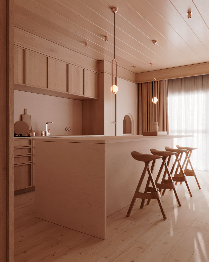 Camera angles for the kitchen.
With the images ready, I took them to Photoshop and did the post-production, putting more contrast and adjusting the colors, so in the end I had the result I wanted.
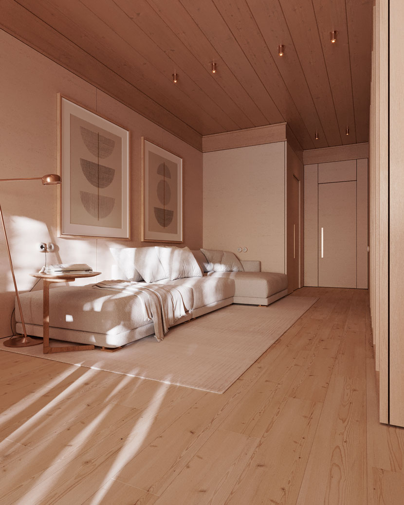
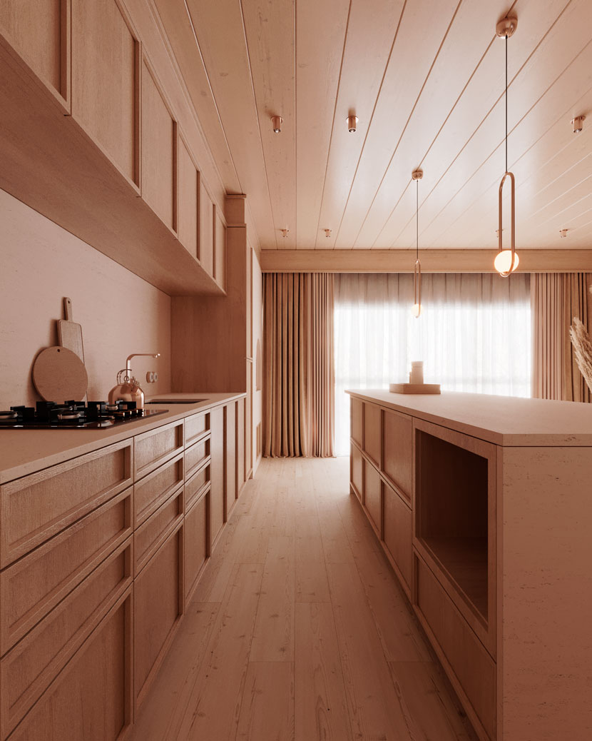
Thanks again for the opportunity Rebusfarm team.
We thank Robert for sharing his project and knowledge with our Rebus community. Check out more of his work on his different channels:
Want to share your work with our community too?
Contact us at This email address is being protected from spambots. You need JavaScript enabled to view it.and tell us about your favorite project.
>> Read more articles on our blog
