Monday, July 1st, 2019 by Vinicius Favero
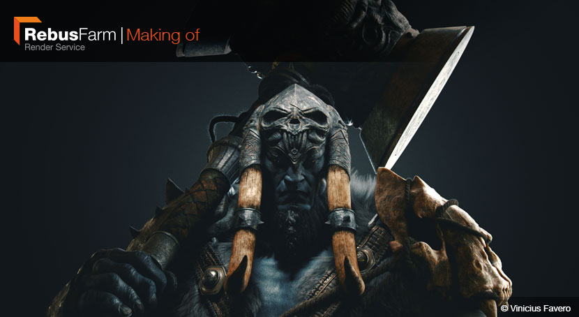
When we asked Vinicus Favero, July 2019 winner of our 3D Artist of the Month competition, to briefly walk us through the development process of his ‘Kangrinboqe Warrior’, we did not expect him to provide a fully-fletched making-of. We are all the more proud to present to you an exclusive and in-depth look at the final project of Vinicius’ mentorship program at Think Tank Training Center.
|
Hey everybody, in 2018 I moved from my home country of Brazil to Vancouver Canada, where I had the chance to participate in the Think Tank mentorship under the tutelage of the amazing Gustavo Groppo! Based on a concept from Yuming Yin, the ‘Kangrinboqe Warrior’ was my final project. The goal was to build a high-quality feature film character, and stepping out of my comfort zone and exploring hitherto unfamiliar materials and techniques proved quite challenging. It took me around three months to complete the final render, and now I’m happy to share my experience with you in the form of this making-of. Without further ado, let’s get into it! |
Modeling
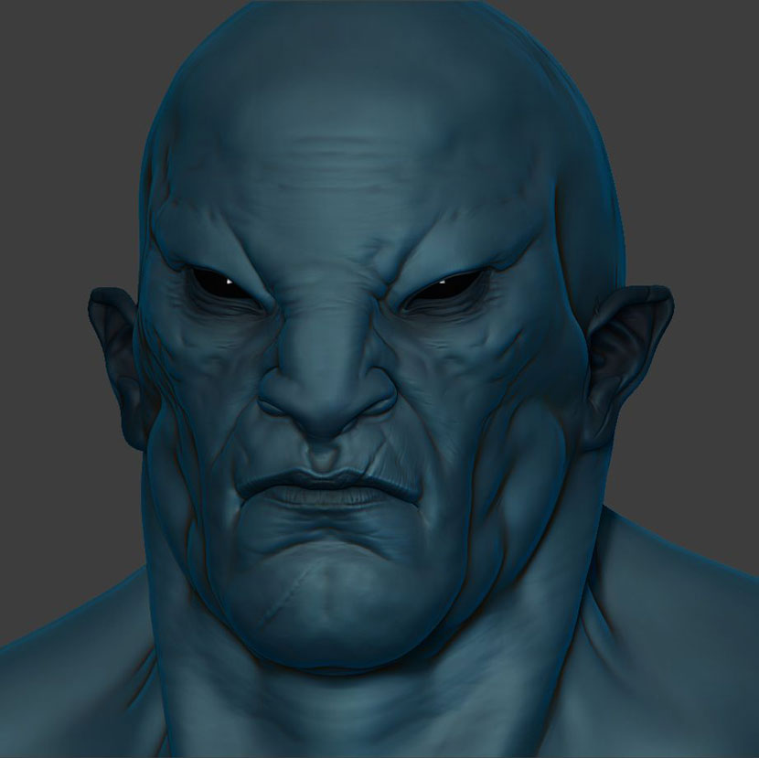
Once I had decided on a concept, I started messing around in ZBrush to define the initial shapes and find the correct silhouette.
To me, it’s crucial to work with real-life reference images instead of other drawings or models. So, I gathered a whole bunch of aged bodybuilders as well as other bulky guys to better understand the anatomy of this particular body type. To get an idea how to apply this knowledge to a fantasy setting, I studied drawings from Gio Nakpill.
In Yuming Yin’s original concept, the warrior’s face is not sufficiently defined to transpose it into a 3D environment, so I had to come up with a solid anatomy that was in tune with the rest of the character from scratch. I just pinned some key points to help me sculpt, like the flat feline nose (think Azog from ‘The Hobbit’), the slanted eyes and the pointy, orcish ears.
The accessories tie everything together and help balance the character. For some of the gear, I took the creative liberty to deviate from the original concept: I took out the spikes on the skull of his shoulder and came up with a completely new design for the right arm.
Texturing
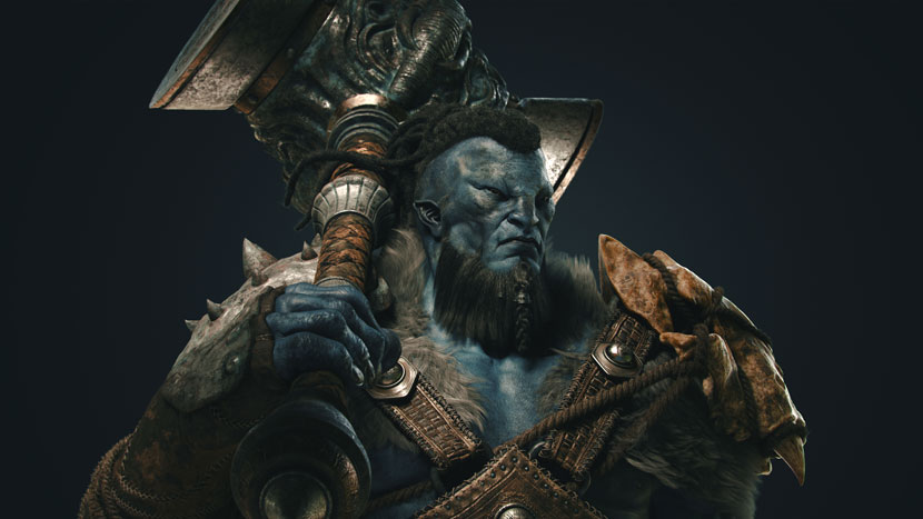
A good texturing workflow requires sufficient planning: Organize and layout your UVs according to the software you plan on using use and how you will texture each part.
Personally, I organize my UVs by grouping them by material per row. This way, it’s easier to know where all the metals or the fabrics are, and you can paint similar materials at the same time, speeding up the actual texturing process significantly.
There’s 75 UDIMs in this project in total. I tried to keep them big enough to have close-up shot in good quality, without too much complexity or unnecessary exaggeration, as I wanted to keep the file light and clear.
Texturing the skin
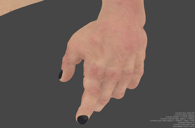
I decided to use Mari to texture the skin for several reasons: Its power to project and handle huge 32bit maps, for once, plus the flexibility to edit and paint more details by hand across the 22 UDIMs I had for the warrior’s skin.
Before I started painting, I separated the amazing XYZ skin maps that I wanted to use in my projection and composed them in Photoshop. To get more control over my displacements, I figured I needed to have them separated in layers: the secondary forms (wrinkles and the small deformities of the skin), the tertiary details (pores and smaller wrinkles) and the micro (a blend of the general details, that also helps to break the specular highlights as well).
Combining these three detailed maps into one single file separated by channels, allowed me to paint all of the at the same time in Mari, not having to worry whether they will match the texture.
Having projected my displacements all over the character’s body, I moved onto colors. Putting the bump maps underneath, it was easier to project some polarized pictures and see the results immediately. Doing so, I could project a real skin texture and make it look as natural as possible, then just tweak the colors and turn the entire set blue.
Texturing the props
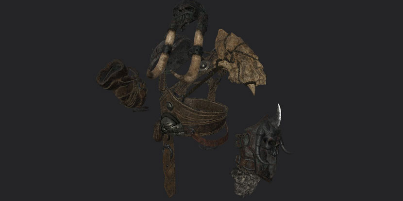
Substance Painter was my first choice for the props, not only for its speed, but because most of the props have a procedural base. Using a small breakup on the top, and knowing that it doesn’t paint across UDIMs, it’s pretty easy to manage the seams.
Another important thing to keep in mind when you are texturing in Substance Painter, is that the generators and masks only work when you bake the utility maps. Instead of having a baked low-res mesh, I opted for a more high-res one, then used this very mesh to generate utility maps for my textures to work. This makes it easier to see the small details working “physically” than through a normal map.
What’s wonderful about texturing in Substance Painter is that you can create a very good base for different variations of the same material.
For example: Once saved onto a smart material, it’s possible to replicate a leather base for other pieces, adjusting the properties to create a more aged or damage look. Not having to make new materials for each individual part saves you a lot time, but it’s still important to maintain and finetune the pieces to achieve a coherent look overall.
Hair and fur
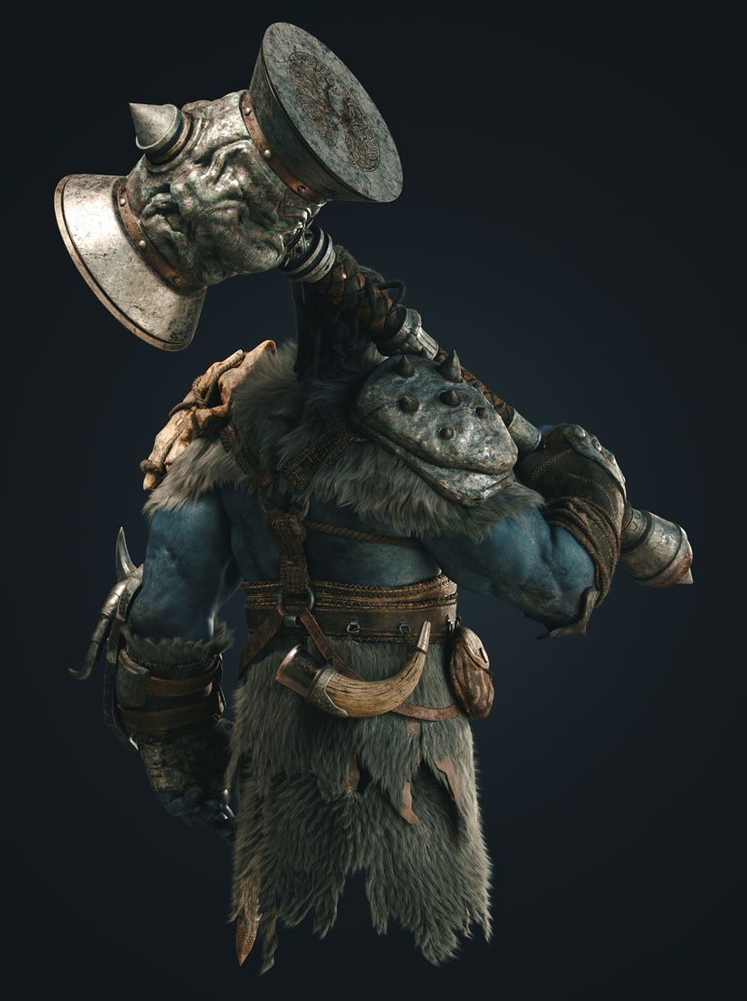
For the hair and furry textures, I used XGen in Maya. Beforehand, I did a quick preview in ZBrush with the FiberMesh tool; this allowed me to get a proper feeling for the volume of the hair in relation to the overall composition. Once in place, I reduced the fiber count and exported it to Maya. The hair shader is a simple V-Ray hair shader with a color variation.
Lighting

To set the mood for this fierce warrior, I desired something more dramatic. The overall scene is rather dark, but at the same time I wanted a light setup that directs the viewer's eye to a specific point of the character. The interplay between light and shadow also gives the entire scene additional depths.
Among the esteemed great painters of the past, Caravaggio has always been my favorite. I especially admire his unique approach in creating dense atmosphere through lighting. Trying to achieve a similar effect, I created a simple light setup, with a good HDRI that provided me most of the fill light of the scene, a key light that directed the viewer’s attention to the face of the character, and a strong backlight that cuts off the character from the background and helps to show a better silhouette.
Hope you enjoyed my little making-of and thanks for reading!
If you haven’t already, make sure to check out our interview with Vinicius Favero. Check out more of his work here:
HOW TO JOIN OUR MONTHLY CONTEST
You want to be our next featured 3D Artist of the Month and win 250 RenderPoints? Just visit our 3D Artist of the Month competition page and submit your entry. We'll choose the best image and contact the winner.
