Monday, September 16th, 2019 by Julian Karsunky
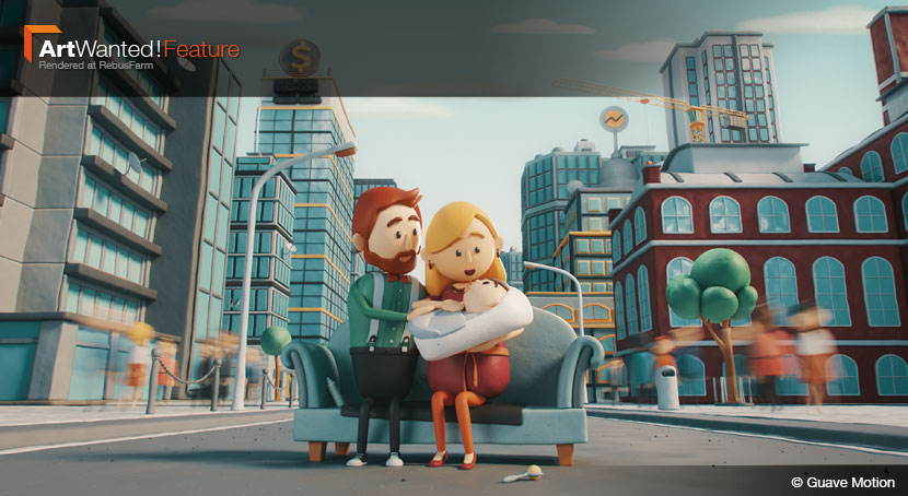
In everyday life, we’re always prone to lose sight of the wonders of the world around us. In our business, for example, it is easy to forget the pure and simple visual joys of 3D artwork. Thankfully, every once in a while, a piece such as Guave Motion’s ‘Economy is Care’ animation comes along and rekindles this childlike delight. An explainer video with a serious message at its core, the Swiss studio created a world so rich in charm and detail, you can’t help but get drawn in.
In our interview, 3D artist Andreas Tanner talks about visualizing abstract concepts, managing hundreds of assets and models and putting a twist on traditional claymation.
Hi Andi, thank you so much for joining us! To start things off, please introduce yourself to our readers!
Hi everybody, my name is Andreas Tanner. I’m 29 years old and I’m from Schaenis, Switzerland, where I work as a 2D and 3D artist at Guave Motion. Since we’re a small and tightly-knit studio, I also help out with administrative tasks such as acquisition and corporate strategy.
Do you recall when and how you first consciously encountered CGI?
It was 13 years ago during my training, I think. We had to engineer a water-powered rocket and, as part of the project, I was asked to create a small 3D visualization in Cinema 4D. That was my first time using 3D software. Several years later, when I was attending University of Applied Sciences of the Grisons, I decided to pursuit a professional career as a CG artist.
What training or education do you have?
I have a bachelor’s degree in multimedia production. I spent two years studying abroad in Stuttgart, Germany, where I learned a lot about 3D and visual effects through an internship at Unexpected GmbH and in school projects at Stuttgart Media University HDM. Sometime later back in Switzerland, I took a six week training course called LUMAA (Lucerne Master Academy of Animation), where I would benefit from expert instructors from major studios like Weta Digital and DreamWorks.
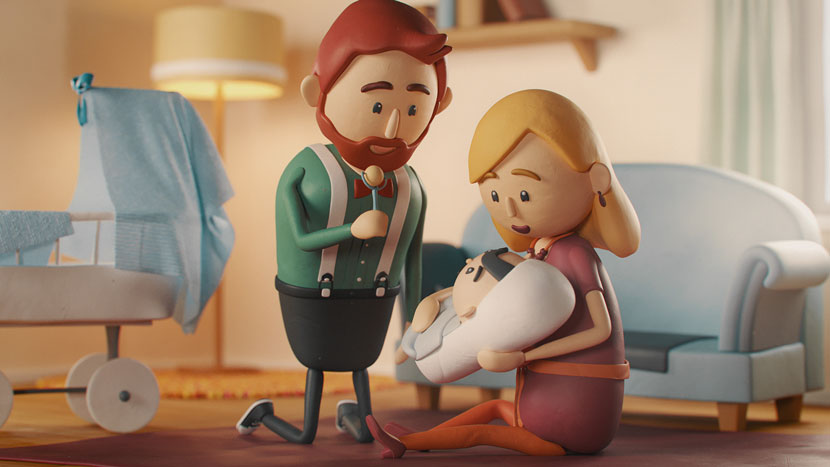 Just one of many wholesome scenes from the ‘Economy is Care’ animated short.
Please tell us more about Guave Motion, the company’s history, its field of work and general philosophy. When and under what circumstances was the studio established?
Our history is too long and convoluted to tell in full here, so I’ll give you the short version: we started 15 years ago as a group of young teenage guys that wanted to revolutionize the internet. Eventually, we ended up as a company with two business branches: Guave Motion, our production studio, and Guave Interactive, which is our e-commerce agency.
What services do you provide?
As a whole, the range of our services is quite large. As a production company, we primarily do film and animation. Sergio Herencias is our inhouse director, cinematographer and motion designer. I’m responsible for all kinds of 2D and 3D animations, and David Fritsche is our 3D Artist with a flair for scripting and technical direction. Our client base mostly consists of advertising agencies and film production companies. We also do consulting and concept development.
Is there a specific design philosophy or school of thought Guave Motion adheres to?
One of our core philosophies as a company is to allow ourselves to question the client. We don’t just blindly do our work. At the end of the day, we strive to create something that fulfills its core purpose – but sometimes, this purpose can get lost in communication. Other times, ideas can sound really cool and creative at first, but turn out to be not practical. Furthermore, we always want to deliver the best bang for your buck and if we’re allowed to take the creative liberty to get a little crazy, we’ll gladly put in the extra effort!
What does your usual workflow look like when working with a client?
This might sound a little strange, but the first thing we like to do is simply getting to know each other. I think it’s very important to get a ‘feeling’ for each individual client and vice versa. We try to get involved very early on in a project and help develop the concept. This includes the usual stuff: concept design, moodboards, storyboarding, you get the idea.
Then, during production we try to be as flexible as possible, because things tend to change on the fly and we need to be able to do changes without starting from scratch. Still, there are certain milestones that have to be set, there’s no way around that, sadly. We keep our clients up to date during the production and frequently share our progress.
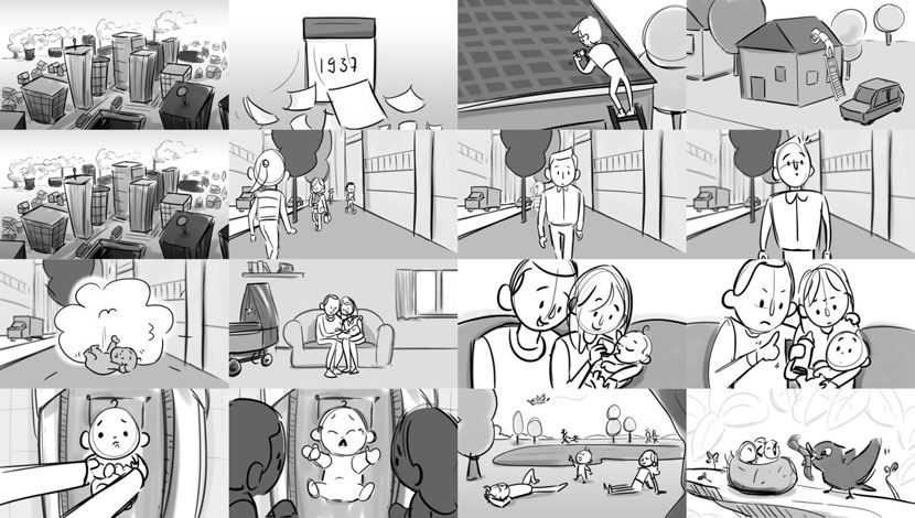 The ‘Economy is Care’ short was a project of enormous proportions. Storyboarding alone took three weeks!
Let’s talk about your work in more detail, namely your submission to our ArtWanted! campaign, the ‘Economy is Care’ short. Starting with some basic information, can you first tell us more about the client behind the project.
Our client is a Swiss organization called Wirtschaft ist Care, which translates to ‘economy is care’, WiC for short. They’re committed to the reformation of the global economy towards its original roots, which is the satisfaction of actual human needs worldwide. The founder and our direct contact from WiC were Ina Praetorius, as well as her husband Hans Jörg Fehle.
How precise were the client’s wishes? Did you have a lot of leeway or were you working under strict requirements, both in terms of script and style?
We’re very grateful for the leeway Ina granted us. She still supervised the development of the script, of course, it’s her daily business, after all. But from that point on, we were free to choose which direction the visual imagery and animation should take - and that was a blast! She was always impressed when we showed her the progress of the project and thus gave us the OK to continue our work.
How long did it take you to complete the project?
Well, we needed about five or six weeks to finish a script everybody was happy with. Another week passed until the city concept and character designs were done. Then we spent another three weeks on the storyboard. So, all things considered, preproduction took about ten weeks. Then production itself went on for about nine months. Overall, the creation of the movie took nearly a year.
What were some of the challenges you had to overcome?
That’s a tough question, as we faced a lot of different challenges during this time. We’re a small studio with three employees and only one person was working on the project full time. Therefore, I’d say efficiency was a key factor.
For example, we had to build this huge city with all its assets in just seven weeks. We then had to make this city look great in total shots as well as in close ups, meaning we had to change material properties like displacement and bump scale to let the dough look realistic in its dimensions in every shot.
Last but not least, we had to deal with a lot of characters. In total, we needed more than 20 different characters. To be as efficient as possible, we made a base model for a man, a woman and a child. With these three models as a solid base, we built all the other characters with their own characteristics. The rigging was done through CAT rig in 3ds Max. Thanks to CAT rigs, instead of having to build 20+ different rigs, we could use one male rig for all men and one female rig for all women. instead of having to build 20+ different rigs. The skinning for the character bodies was always unique and had to be done manually for every single character. The same applied to all the different faces.
A city comes to life.
Thematically, the video deals with complex and abstract concepts such as our understanding of economics, the value of work and gender equality. How do you initially approach visualizing these seemingly intangible ideas?
Just as you said, these concepts seem hard to grasp visually at first. But, if you keep your eyes open, you can actually see these things in everyday life! That’s where we got our main inspiration from. A city is pretty much concentrated economics in action, you have tons of people working in a compact space. That’s why we choose to tell the main part of our story in a city. These everyday moments are also situations that people can easily connect with.
To elaborate on this, how closely linked is the development of the script/narration with the visual storytelling?
They are very closely linked! It was a constant back and forth, always keeping in mind how we could visualize what we were writing. The initial idea is actually from a book written by Ina Praetorius, our client, which is not an easy read (laughs). So, this wasn’t an easy task by any means.
To illustrate the narration, you created an entire world, featuring a vast amount of characters, locations and even time periods! Can you talk a little bit about the scope of the project, especially in regards to the world-building aspect?
First and foremost, the majority of the movie takes place in the city. It was a long and intricate process to build a city that looks like a real place with real dimensions and a lot of details. At the same time, we had a fixed budget and couldn't break it. To save modeling time, the city ended up as a hybrid of a metropolis and a small town. It took us a good seven weeks to build this city with all its buildings and assets. To be as efficient as possible with hundreds of unique assets, we chose an art style which textures and shaders could all be created procedurally.
Apart from the city, we had several other locations such as the migrant worker’s plantation, the scenes set in the antiquity and the explanatory parts, which are spatially isolated. We modified some of our previously used base characters but apart from that, all of these settings had to be built from scratch.
Please tell us more about the distinct art style you opted for! While reminiscent of traditional claymation, I understand you tweaked the frame rate – to what purpose?
We’re all familiar with that classic claymation stop motion feeling, there are hundreds of prime examples out there. However, we found that there were no equally well-made 3D claymations, so we dared to try something new. We thought to ourselves: why artificially tone down the frame rate to maybe 15 FPS when we could animate more softly and more accurate with, say, 25 FPS? A higher frame rate allows for animation that is more fluent and realistic than traditional stop motion, resulting in a more immersive viewing experience!
How naïve is me imagining you having a permanent grin on your faces while working on this video? On a more serious note, in how far does the creation of such a charming world have an uplifting effect on its creators?
Working on this project was an absolute delight all the way through! We immediately fell in love with these little figures. It reminded me of playing with LEGOs as a child, building cities and imagining them full of life.
What software did you use to create this piece? Any plug-ins you found particularly helpful?
We used 3ds Max for pretty much all things 3D. In terms of plug-ins, SigerNoise was very useful to gain better control over the noise parameters. For the smoke simulations, I used Phoenix FD; I like this tool very much, it’s fast and with some tweaking, you get very good results! For compositing, Sergio used After Effects and editing was done in Premiere.
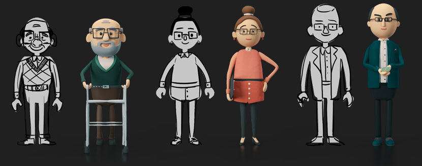 Contrasting the simple sketches with the finished character models, you can see how much the charming art style shines in 3D.
I’d like to take a moment to specifically talk about the explainer video as a medium. What sets the explanation style video apart from conventional image films?
Conventional image films usually don’t feature storytelling that emotionally touches the viewer. To explain a topic as complex as care, it was necessary to immerse the viewer within a little story. In the best case, the viewer can identify himself with one of the characters. This would be the basis for the viewer to get oneself on the word care.
Is there more creative freedom involved in selling an idea as opposed to selling a product?
Yes, absolutely. I mean, if you have to promote a product through a commercial you are bound to many restrictions. You can’t just make what you want, there are things like corporate identities and existing visions from other creative directors you have to follow. In our case, we were to introduce our client’s understanding of the word “care”, nothing more or less. How we did that, was entirely up to us.
Do you have to be at least somewhat sympathetic to the cause to create an authentic or convincing explainer video?
I think there’s a connection there, yes. As a professional, you obviously always give your best, no matter the project. However, in this particular case, I had deeply personal connection to the project: I’m a father of two children, and my wife is a housewife, the idea of care economy is very topical for us. The more I worked on the video, the more this concept resonated with me. Care work is important and we should talk about it! On the other side, speaking only as a 3D generalist, almost every task of this project was just so much fun! Both of these aspects considered, it should come as no surprise that we willingly invested some of our spare time in this piece as well!
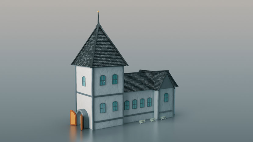 If, like us, you just can’t get enough of assets such as this cute little church, make sure to check out the project page for more!
What has your experience with RebusFarm been like so far? Is there anything you particularly like about our services?
We think the main advantage of RebusFarm is that our renderjobs instantly start rendering, there’s hardly any waiting time if at all. Another plus is that most of our plug-ins ran without problems. And even in the rare case we had compatibility issues with a specific plugin, the support team was so nice to install it on their side in no time!
In closing, is there anything else you want to say? Any present or upcoming projects you’d like to mention?
We’re thrilled to move to a larger office in only a few weeks! Then, we’ll be even more ready to take on new projects and hopefully, there will be things similar to the economy is care among them in the future!
Please keep us updated, we can’t wait to see more from you! Andi, thank you very much for taking the time and all the best in the future!
Keep up with Guave Motion and their work through these channels:
How to join ArtWanted!
You want to get featured in our ArtWanted! campaign and win 250 RenderPoints on top? Submit your work, rendered at RebusFarm, to このメールアドレスはスパムボットから保護されています。閲覧するにはJavaScriptを有効にする必要があります。! Visit our Art Wanted! page for more information.
>> Read more articles on our blog
