
In this making-of article, Bruno Mesquita from Black Visuals Studio develops a whole, nicely constructed theory on how to achieve the best possible photorealistic results according to your skills. Everything starts with the investment you are ready to do in your education. Enjoy!
About me.
Before I introduce you to the making-of article, I just wanted to thank the Rebusfarm and VWArtClub teams for giving me the opportunity to share my work and thoughts. Thank you for the invite!
My name is Bruno Mesquita, a Brazilian architect and 3D artist from Belo Horizonte. I am the part owner and Creative Director at Black Visuals Studio, a 3D studio in Brazil, and part owner and one of the head architects of IBV Architecture, an office dedicated to creating innovative contemporary residential projects. If you aim to know more about IBV Architecture then check out our work on Instagram or our Website.
Today I’m going to tell you a little bit about my story, from my first contacts with 3D to my latest works, and about one of my latest projects: the MF House. My first contact with the Archviz market was in 2016 when I first learned Lumion to represent my projects in college. I instantly fell in love with it, every aspect of the rendering process was so intriguing to me. From importing the project to adding textures, vegetation, and details, and eventually creating a result that makes everyone in the room gasp, I wanted to know much more about this new world I recently discovered. So I did some internet search and found out that every high-end rendering studio uses 3DS Max to create their images.
Back then, I didn’t even know what 3DSMax was. All I knew is that it was the tool I needed to achieve the results I was looking for. So I bought the only “in-person” course I knew and had classes with Rafael Marotta, a local teacher with tons of knowledge about the Archviz world. Although it was only a 40-hour-long course, I learned a lot from him. I was then known as the “render guy” in my university and started doing freelance for my classmates to earn some extra money.
But after learning the basics, even though I had a lot to improve (and still do), I settled. I was focusing on the architect's career, and the rendering process was just a tool to represent my projects. But all that changed in 2020 when I decided to buy Ander Alencar’s course. With Ander’s method, I was able to achieve much stronger, deeper results on my scenes, and therefore create meaning in my projects through Archviz. I believe in the power of good architecture, I wanted to be an artist, to produce pure art. And knowing the proper tools gave me the ability to bring my thoughts to reality.
At the end of 2021, I decided to create the Black Visuals Studio, in order to make a real career out of my skill set and to work alongside great architects to produce visual solutions for outstanding developments. In the span of less than 1 year, we’ve already worked on projects from Finland, Italy, New Zealand, the United States, and many other countries. It is thrilling and exciting to see how the 3D market is overtaking the world, and I’m proud to be a small part of it.
But enough about me, let’s talk about the project!
About The Project.
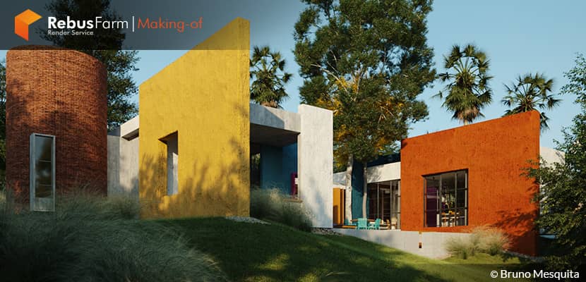
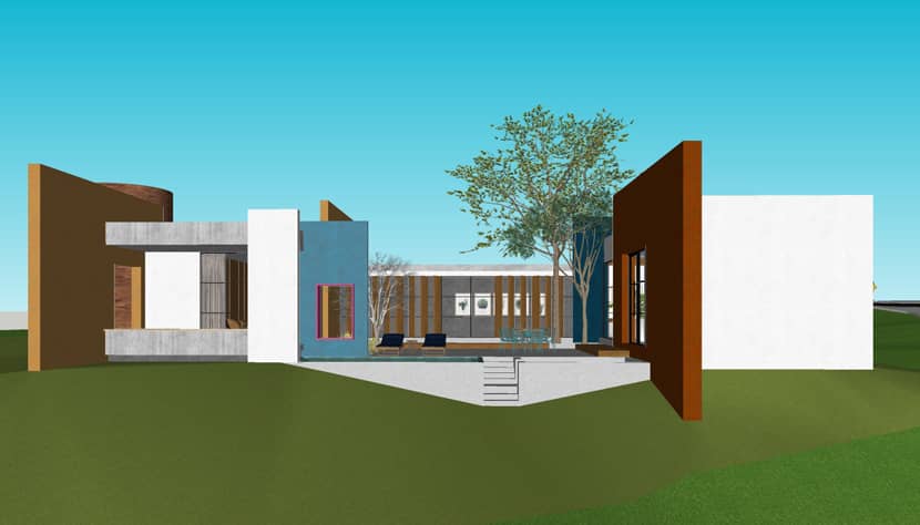
The Project was inspired by Luis Barragan’s approach to architecture, using long, colorful plates to give the project a bucolic and differentiated atmosphere. The color palette of orange, magenta, yellow, and blue is a very interesting composition of colors, and we decided to integrate this into our new project proposal.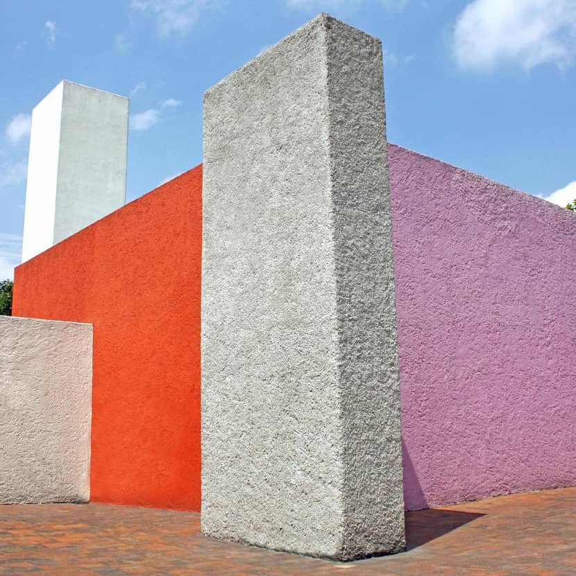
Museo Casa Luis Barragan, 1948. Source: ArchDaily.
Our client, Mariana, likes to talk, she welcomed us for coffee and told us about her life, work, and plans for her new home. He has already set foot in several parts of this world and keeps in her heart colors, environments, and experiences that have been opening up to us like a storybook. From it, “corners” emerged, spaces full of personality that remind a little of the French countryside, the vivid colors of the Mexican Luís Barragán, the English windows, the rusticity and the coziness of a Minas Gerais house.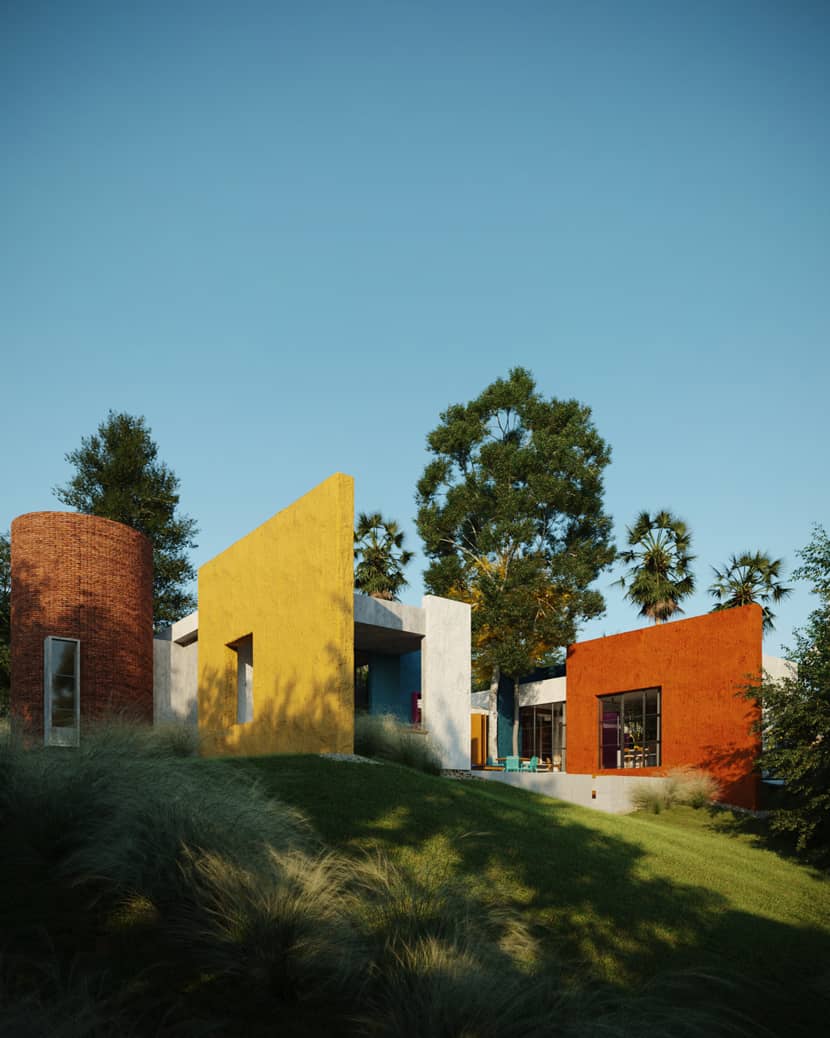
The MF house has an implantation that, from the beginning, received the “U” shape. This shape allowed the project to have a generous central patio, that came to life through large colored walls in whitewashed painting, that frame the environments and reveal the scenarios around them. 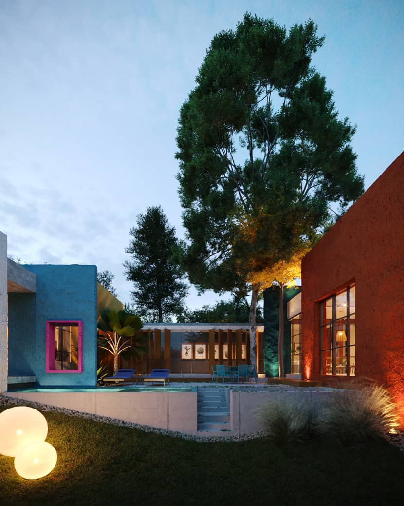
The whole atmosphere gained an air of pictorial, rustic, and contemporary coziness with several special corners, perfect for reading a book, drinking a good coffee, and listening to the wind beat in the woods that embrace the land. I did this scene with great care, working all the textures to try to replicate real life as much as possible. The resemblance to an artistic work allows us to explore the scene further, looking for angles that would not be so usual in a common project.
Software Used.
I used SketchUp and 3DS Max for modeling, Corona Renderer 7 for rendering, iToo Forest for scattering, HDRI Haven for HDRIs, Quixel Bridge and Mixer to create textures and import some models to the scene, and Photoshop for post-production.
Modeling.
I’ve always associated the modeling part with creation. Since I create my own projects most of the time, I use the modeling process to explore new alternatives, approaches, and perspectives on an architectural project. I’ve been working with SketchUp since 2014 when I first started college, so it’s a program that flows very naturally to me. I know a lot of 3D artists consider SketchUp a “beginners only” type of software, but I disagree. I think it is a great option to speed up the architectural modeling process, especially because it’s mainly simple geometries such as flat walls, windows, doors, and so on. My model on SketchUp looked like this: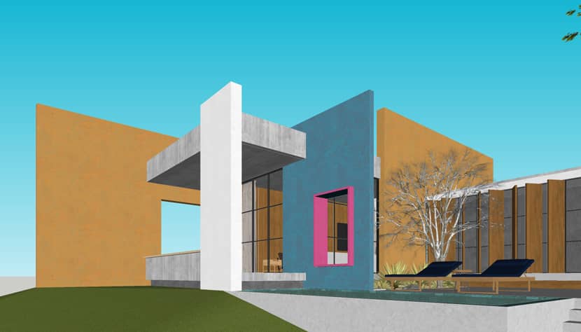
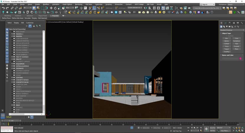
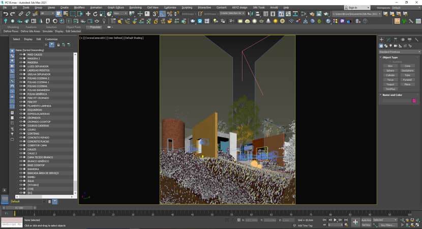
As soon as I import this model on 3DS Max, the next steps are to texture, attach and name every single object on the scene until it looks something like this: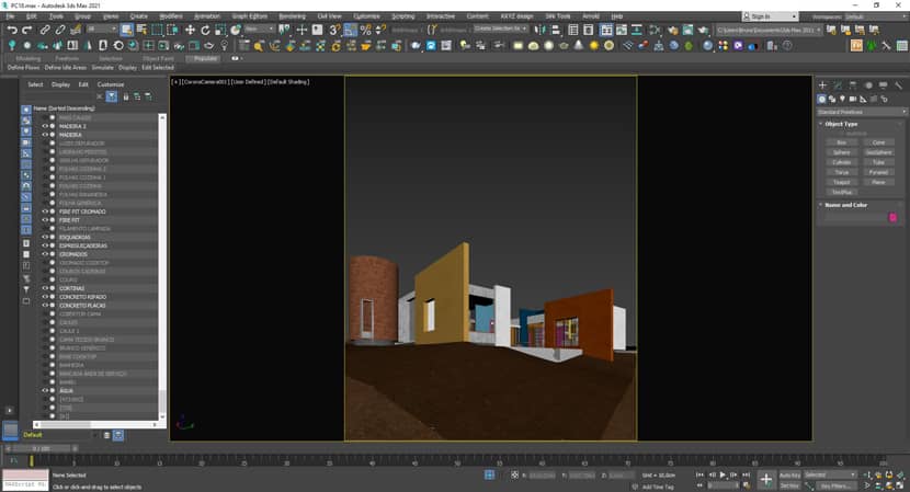
Materials.
Most textures I used from the Corona library itself as it has excellent materials and it’s easy to apply and use. When I had to create something more specific, such as the whitewashed walls, I used Quixel Mixer: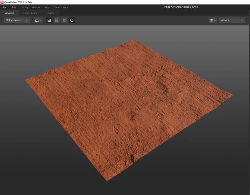
Quixel Mixer is a great tool to create textures for your scene. In there you can overlap textures, and create decals, all using Quixel Megascans libraries, which are rich in details and very well done in general. I used the same tool to create the bricks, concrete, and a few other materials for this project as well.
Vegetation & Assets.
That’s when the fun starts. As soon as I have the model organized and textured, it’s time to add vegetation, furniture, and assets in general to the scene. I mainly use Max Tree’s on vegetation assets, they have one of the best models available today in the market, but I also used Globe Plants for the grass and a few Quixel Megascans and Evermotion assets to add in details. In the end, it looked like this:
When it comes to vegetation, I like to think of the landscape as a blank, open canvas. Nature melts in with its configurations, I usually paint a few layers deciding foreground, midground, and background compositions, to give that natural look to the scene. The tool I use for that specific step of the process is the iToo Forest Pro plugin, the best one available in the market for scattering purposes.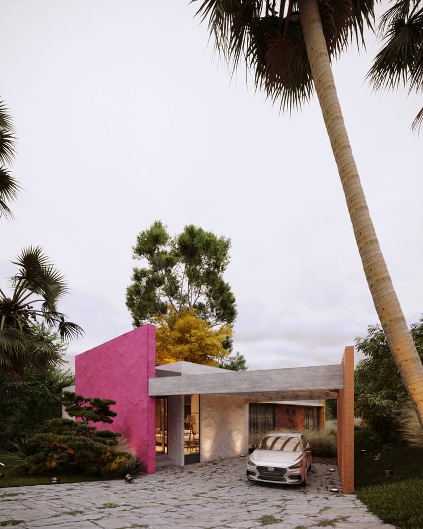
I think this camera might illustrate well the point I’m trying to get across. We have 5 very expressive layers of vegetation in this image:
1 - The layered grass as the base;
2 – Low bushes to give depth and volume to the Garden;
3 – Mid height assets such as the one on the left in front of the magenta wall;
4 – High trees to stand out in the landscape;
5 – Palm trees give personality, charisma, and a tropical look to the scene.
If you take a look around at all the images of this project, you’ll notice that these layers are always present. It is the best way to represent a natural-looking landscape!
You can find tutorials on how to use the iToo Forest Pro software easily on the internet. This one below could help you to get started:
Lighting.
When I’m creating the lights of any scene, the core idea is to test, test, and test again. You need to test at least a few lighting options if you’re truly searching for the best possible result. In this scene, I worked with 3 out of 4 of the main moods in the Archviz market: sunny, golden, overcast, and blue hour. And each one of them had a different approach when it comes to color, artificial lights, and sometimes even composition. The main goal is to reach the perfect balance between light and shadow while always respecting the project's information. If it’s a house in the middle of the desert, you can’t expect the scene to be fully covered in shadows, right?
OVERCAST.
That’s the “safest” lighting. It respects the objects' true colors, not distorting any perception of materials or vegetation. I usually tend to work on the scene using overcast lighting for previews, because it lights up everything, showing every possible gap in the composition due to the lack of shadows. If your scene is well composed in an overcast lighting scenario, it will be well composed in any mood.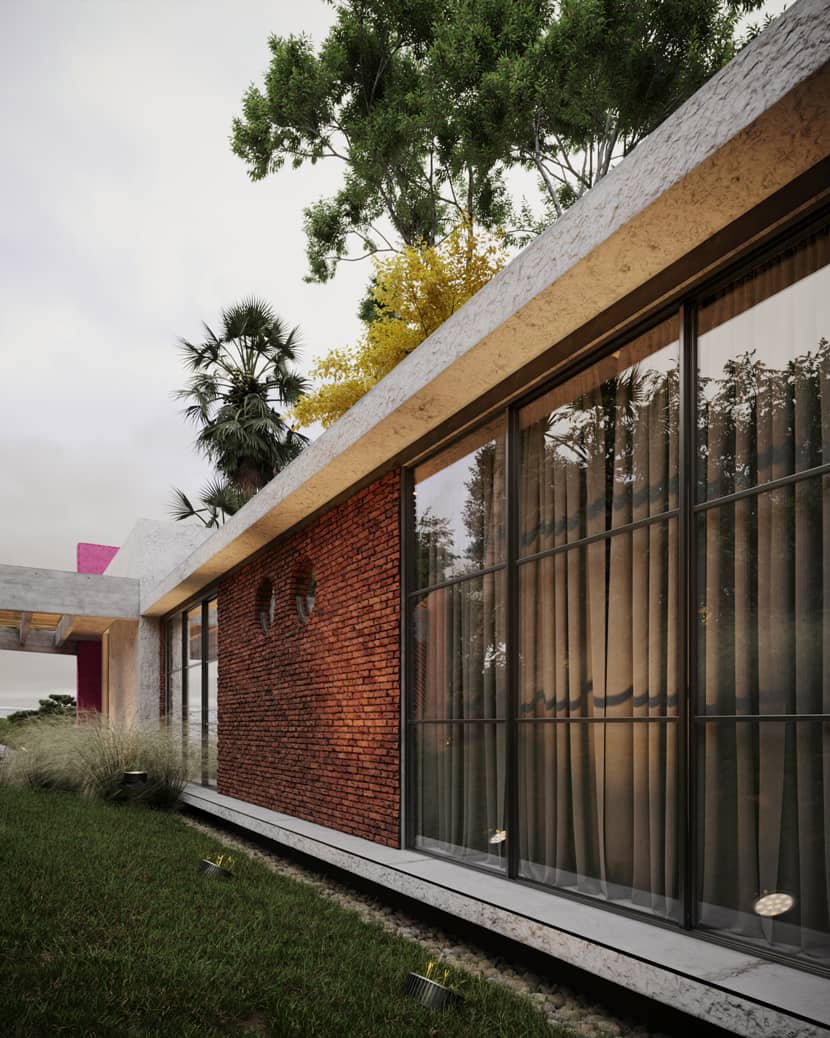
SUNNY.
Daylight scenarios are interesting because it really shows how the project behaves on a common day, and are by far the most desired ones in the market. If you ask me, personally, I try to avoid it: after a few projects, you start to notice they all kinda look the same in this mood. But still, you can achieve strong results with this type of lighting nonetheless. Watch out for excessive highlights though, they tend to be very common in this mood.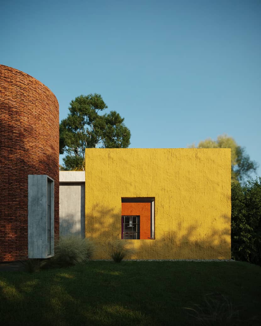
BLUE HOUR
In my opinion, one of the hardest moods to achieve good results. The usual lighting hierarchy doesn’t apply here: artificial lights play a leading role in scenes like this, becoming the main source of light. So, in order to light up the scene in a realistic way, you need to really watch out for the intensities of the lights, and the positioning of those as well. And there is no secret formula to it: the secret is to keep balancing them, using a photo as a reference, until it matches in terms of color and intensity.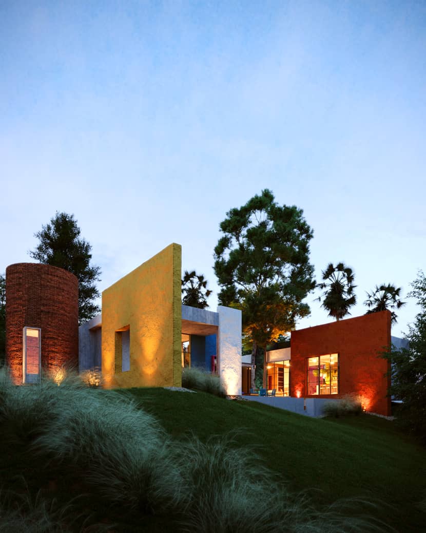
Using HDRI to light up your scene is the best, fastest, most accurate way to go. It is quite simple to add one, the hard part is to adjust it. If you’re not entirely familiar with the process, this video should help you a lot:
Details & Post-Production.
Usually, I avoid adding elements to post-production. I try to make my scene as complete as I can to come out of the frame buffer, but as we all already know, there are always a few teaks to do in post-production. Before going to photoshop, there are a few adjustments that I always make to the frame buffer’s post-production section.
Nothing too fancy, just the main features. A little exposure if needed, highlights, contrast, vignettes... I’ll share the settings for that scene specifically (on the Sunny mood), but don’t cheat off of it: it depends a lot based on the scene, the lighting, composition, everything.
The LUT is almost standard, though. I use that same LUT for almost all of my scenes, and it works like a charm. Super recommend it. But be careful: it can enhance the contrast a little too much sometimes.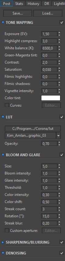
When I’m done with the scene, alongside the beauty map, I add on render elements:
1 - Reflect Map;
2 - Refract Map;
3 - Caustics (if needed);
4 – Ctex Map 1 (with AO on inside);
5 – Ctex Map 2 (with AO on outside);
6 – Alpha Map (if needed).
It should look like this on 3dsmax: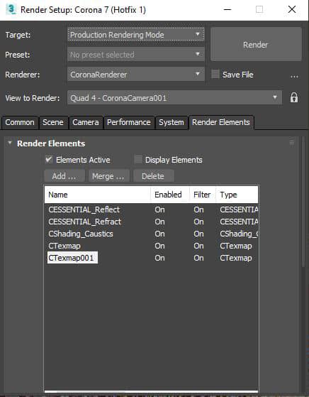
On photoshop, after applying the maps above (with their own modifiers) I normally adjust color balance, saturation, and texture, and add a little noise effect... If I went into details about that here, it would be a whole new article. The main tip I’ll give you is this: adjust the color balance in your image with a similar photographic reference side by side with it. It helps a lot!
If you’d like to see the full scene, you can access it on our social media channels, at the end of this article. To summarize the whole article down, I would divide the process of the making-of into 5 big steps (disregarding the creation process):
MODELLING: The part where you create the ground of everything. This is when you need to pay a lot of attention to details: door hinges, knobs, screws, and drain pipes... Everything matters. If you want to replicate reality, everything needs to be like it would be in reality.
TEXTURING: I’ve seen many artists try to rush this part of the process, considering it less important. It is not. Texturing is what brings your modeling alive, one step closer to reality. You need to consider stains, scratches, leakage, and patches... All with a lot of care and sense. Much like modeling, everything matters.
COMPOSING: My favorite part. Just as in the two steps above, this part requires attention to detail. Pebbles, leaves, layered grasses, and vegetation. The imperfections of the real world really need to pop out on this step. Just think about it: what looks more natural, to be surrounded by nature itself on just a grass lawn with a few bushes on it?
LIGHTING: The most important part of all. Rendering is all about the light. It doesn’t matter if all the other steps are done to perfection: if the light is off, the whole scene is off. And there is only one way to achieve the perfect light: testing it over and over again. Don’t be afraid to experiment on that part, go bananas with it. And always with a photo reference by your side!
POST PRODUCTION: Might sound less important than the previous steps, and to many, it might even be. But, much like the texturing step, it is not: post-production is a vital part when it comes to correcting color tones and highlighting details of your scene. It might sound disposable, but it’s a crucial step that many times separates an okay 3D artist from a high-end professional. To achieve an outstanding image, post-production is key.
And that’s it! If you’ve come this far, thank you. I hope the contents of this article help you in any way through your journey, and if you have any questions you can reach me through our Instagram profile. Thank you VWArtClub and RebusFarm team again who reached out to me to make this happen. I’ll be posting new content on the Facebook *Group soon, so feel free to check it out!
Have a great day,
Bruno Mesquita from Black Visuals.
Check more of Bruno's work on these channels:
Want to share your work with our community too?
Contact us at Questo indirizzo email è protetto dagli spambots. È necessario abilitare JavaScript per vederlo. and tell us about your favorite project.
Get started with your own renderings