Friday, March 4th, 2016 by Nadine Obst
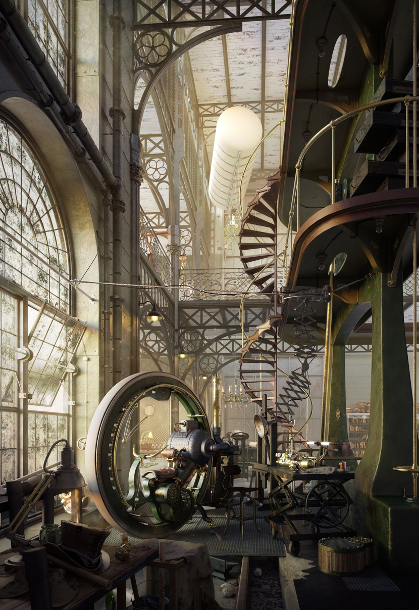
Last but not least Robert Filipowicz, the winner of the Evermotion Challenge 2015 "Whola Lotta Loft" also took the time to tell us more about his winning image and the idea behind it. What an amazing steampunk loft, don't you think?
Hello Robert, congratulations on first place! Please tell us more about yourself and your 3D background.
Hello everyone! My name is Robert Filipowicz and I study Interior Design at Bialystok University of Technology in Poland. I've been interested in 3D graphics since the beginning of my studies. By the second year I was sure I wanted to dedicate all my free time to developing my skills in this field. Currently, I'm on my fifth and final year of my studies. My second hobby is dirt jumping (jumping with a bike), I haven't achieved a lot in this field though. After my first contact with 3D graphics, bike riding kind of became less and less important to me. I never expected it to take its place, but now 3D is my passion! My greatest goal is to become a professional 3D artist and I´d really like to cooperate with other artists. In my opinion, it´s the best way to gain skills. Well, as you can see, there's still a lot of work ahead.
How come you entered the Evermotion "Whola Lotta Loft" Challenge 2015?
Almost since the very beginning of my studies I've always liked frequently checking the Evermotion Forum. The work I saw has made a huge impression and it became sort of a benchmark of what I want to achieve myself. I came to the conclusion that participating in the challenge would be not only great practice but also a chance to check myself in terms of skills. The best judges are people who don't know you and don't hesitate to tell you the truth. Such opinions are priceless. I was wondering how my project and idea would be received, but I never ever expected such a warm response!
Why did you choose this particular look? What's the idea behind your picture?
I have to admit that the work of Gleb Alexandrov was a huge inspiration to me. I thought it would be nice to break with the conventional idea of a loft and I also wanted to tell the story of the interior. My aim was to create a valuable picture and move away from the standard visualization a little. Ever since I saw Gleb's work, I knew I wanted to create something with a similar theme. I thought that the idea of a loft as a working place, combined with the living space of a steam machine constructor would be interesting. In my story, an old engine house was made into a loft. Actually, from the beginning, I knew which combination of colors should be there. I wanted warm lighting and the sunbeams to enter through a window and enlighten the steam machines. For me, that was the key to creating an intriguing ambiance. I can confidently say, that if I lived in such a world, my loft would look exactly like this! I like to tinker and that's probably why I made up such a working space. The creation process of that picture was really fun!
What makes Steampunk so fascinating to you?
I'm attracted by the Steampunk ambiance, fascinating colors and intriguing forms. Steam machines haves this "something" that makes them special to me. I guess you might call it "soul". When I imagine a Steampunk world, I can hear the hiss of steam, the sound of airships flying...pure magic!
Which software did you use to create your image?
The picture was made with 3ds Max and V-ray. I used Photoshop for postproduction and the BerconMaps plugin for the bump. I've been working with 3ds Max software for about two years now. Earlier I used Cinema 4D but I think changing to a different software was a good decision as there are more tutorials on 3ds Max than on C4D.
Can you show us a step-by-step making of your steampunk loft?
Yes of course! :-)
The first thing which I modeled was a huge machine. I was sure this is a "must-have" for my project.
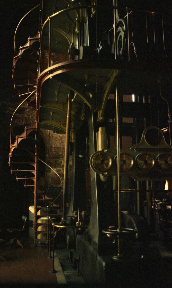
Reference
Modelling
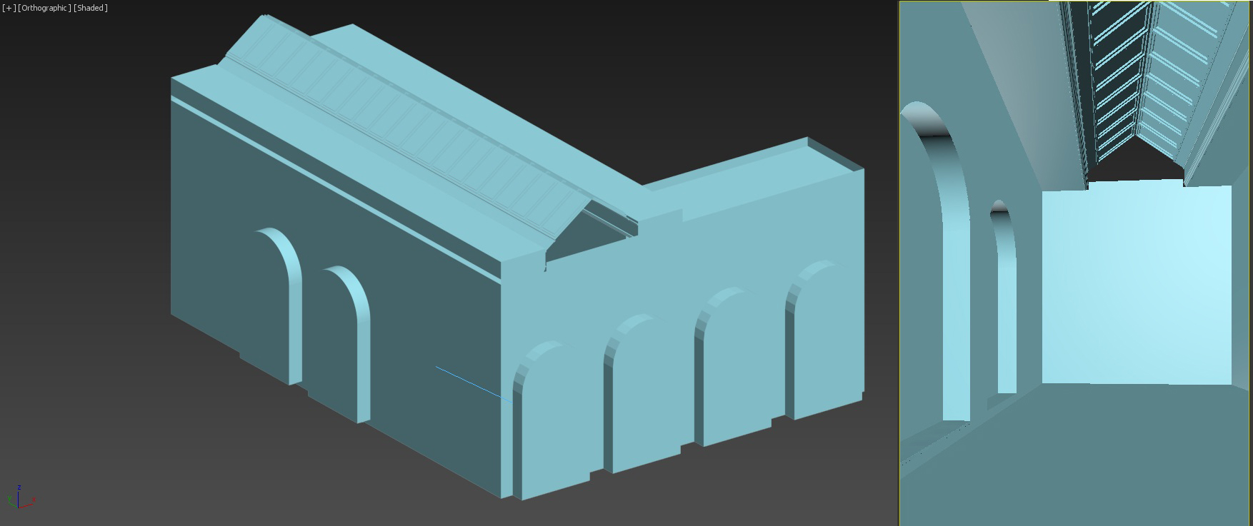
Then I defined the arrangement of the walls. I assumed it was going to be a high, lofty room.
First steps with form and composition
While surfing online to find something that could be the focal point I came across the steampunk style monobike model created by Stefano Marchetti. At first, I thought it was a 1:1 model, however, after a short analysis it turned out to be a thumbnail. Mindblowingly detailed! Perfectly suited the vision I had in mind.
Monobike references. Real model made by Stefano Marchetti
I wanted the room to be high and lofty. That's why I decided to use a vertical frame. I highly recommend the method of creating compositions based on very simple forms. It enables you to quickly find out which idea you like the most and you're not wasting any time on modeling an object that might turn out to be mismatched in the final phase.
Composition steps
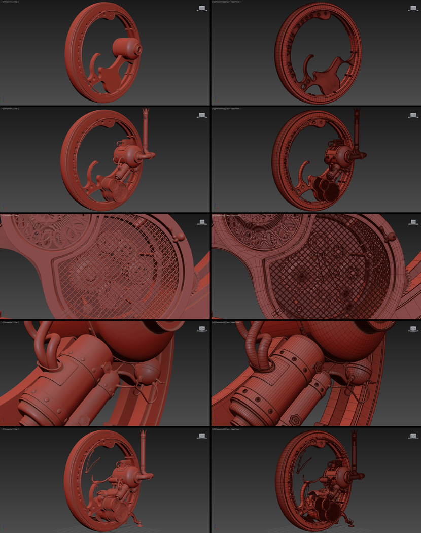
When I was sure the composition would finally look ok, I proceeded to the modeling of the monobike which has been the most laborious part during my project.
Monobike wireframe
This is what the final composition looked like. I added the metal panels with rivets on the walls. The pipes complete the interior's Steampunk character. I also wanted the living space to be visible in the final picture.
Final composition
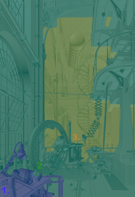
In the main frame, I distinguished three planes. In the foreground, there are elements in the left bottom corner. I decided to not illuminate them much more. In the second plan, there is a model of the monobike illuminated by sunbeams which enter the room through the window. The third plane is the living space of the constructor. I also added a balloon which perfectly fits the steampunk ambiance.
Plans
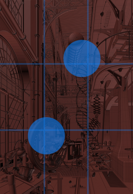
The overall composition was based on the rule of thirds.
Rule of thirds
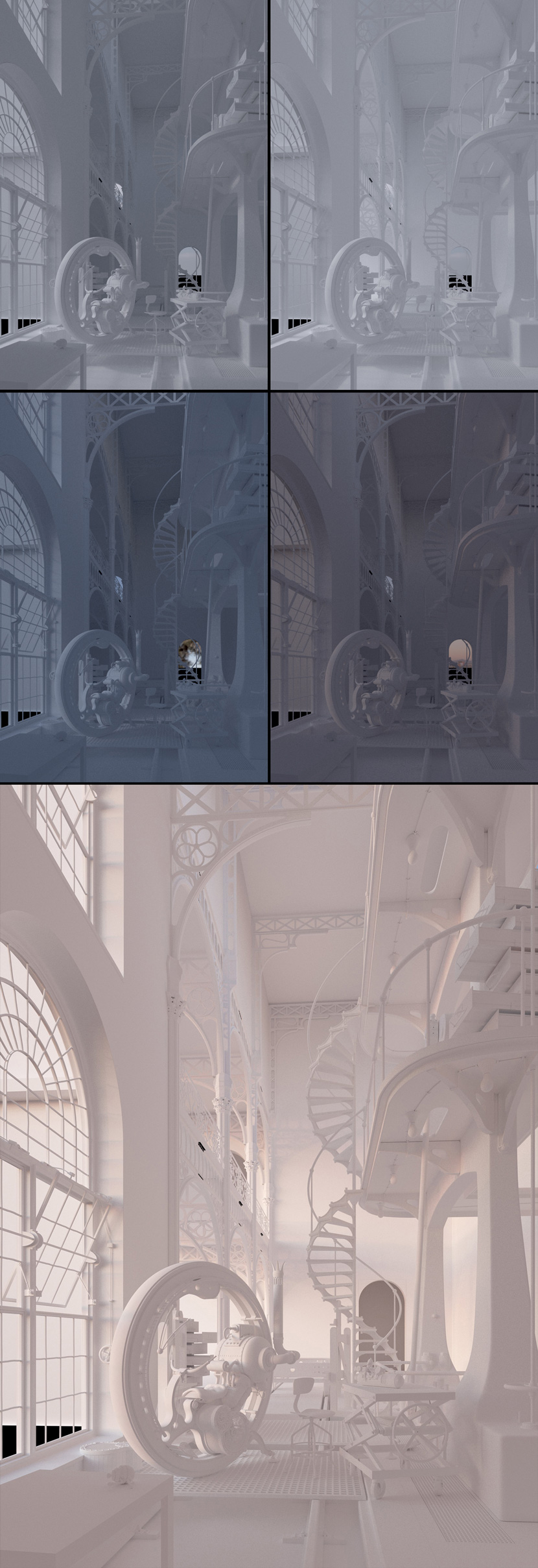
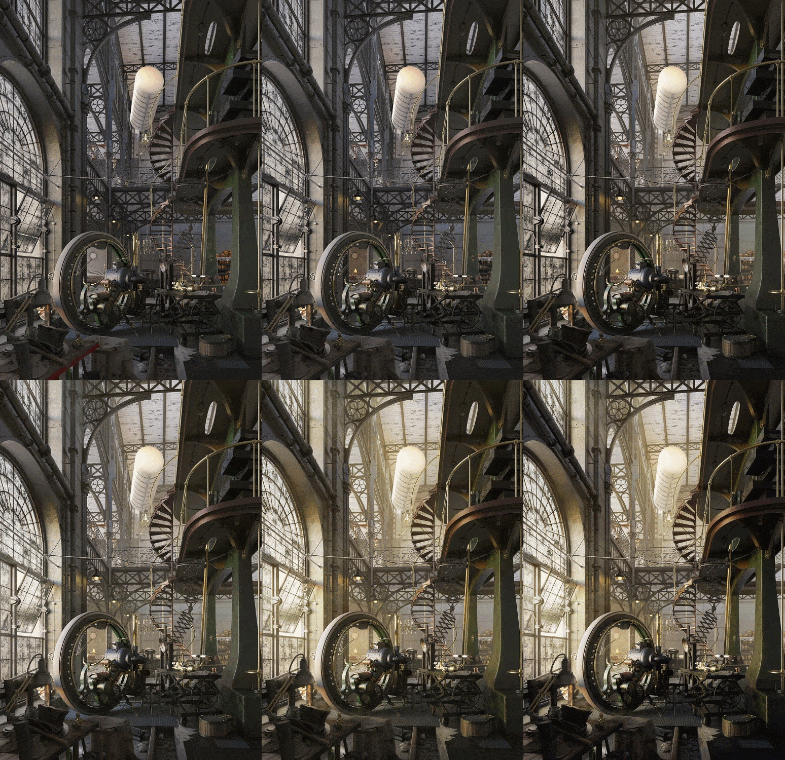
Here you can check out some test pictures with different types of lightning. The last version I liked the most so I chose it to be the final render.
Test renders with different lighting
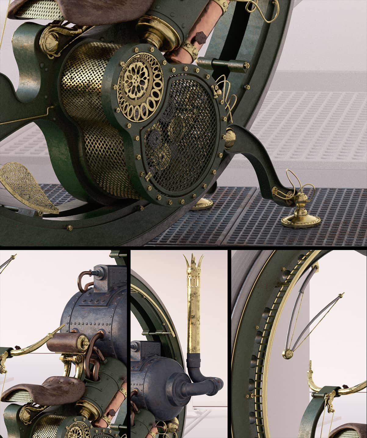
Test renders of created materials
Postproduction steps
Can you tell us what was the most challenging?
One of the biggest challenges was to model the monobike which took a lot of time and effort. I aimed at a high level of detail which resulted in more work than I expected. The idea of adding as many interesting elements as possible was haunting me and it became difficult to stop. But, of course, I couldn't reserve two months just for modeling objects. At times I tried to simultaneously work on too many things at once. And in the end, the decision on the final composition was quite hard. I guess the more time you spend on one project, the more difficult it can get to make the right decision. Luckily I made it and I'm quite satisfied with the final image.
You´ve won Renderpoints to use our service. Congratulations! Have you used RebusFarm before?
Thank you! Actually, I have never used a render farm before. But I am all the more eager to test it now. I will use my RenderPoints for a high-resolution picture, probably personal work.
Big thanks to RebusFarm for great opportunity to talk about my work and also about myself!

