Wednesday, April 5th, 2017 by Julian Karsunky
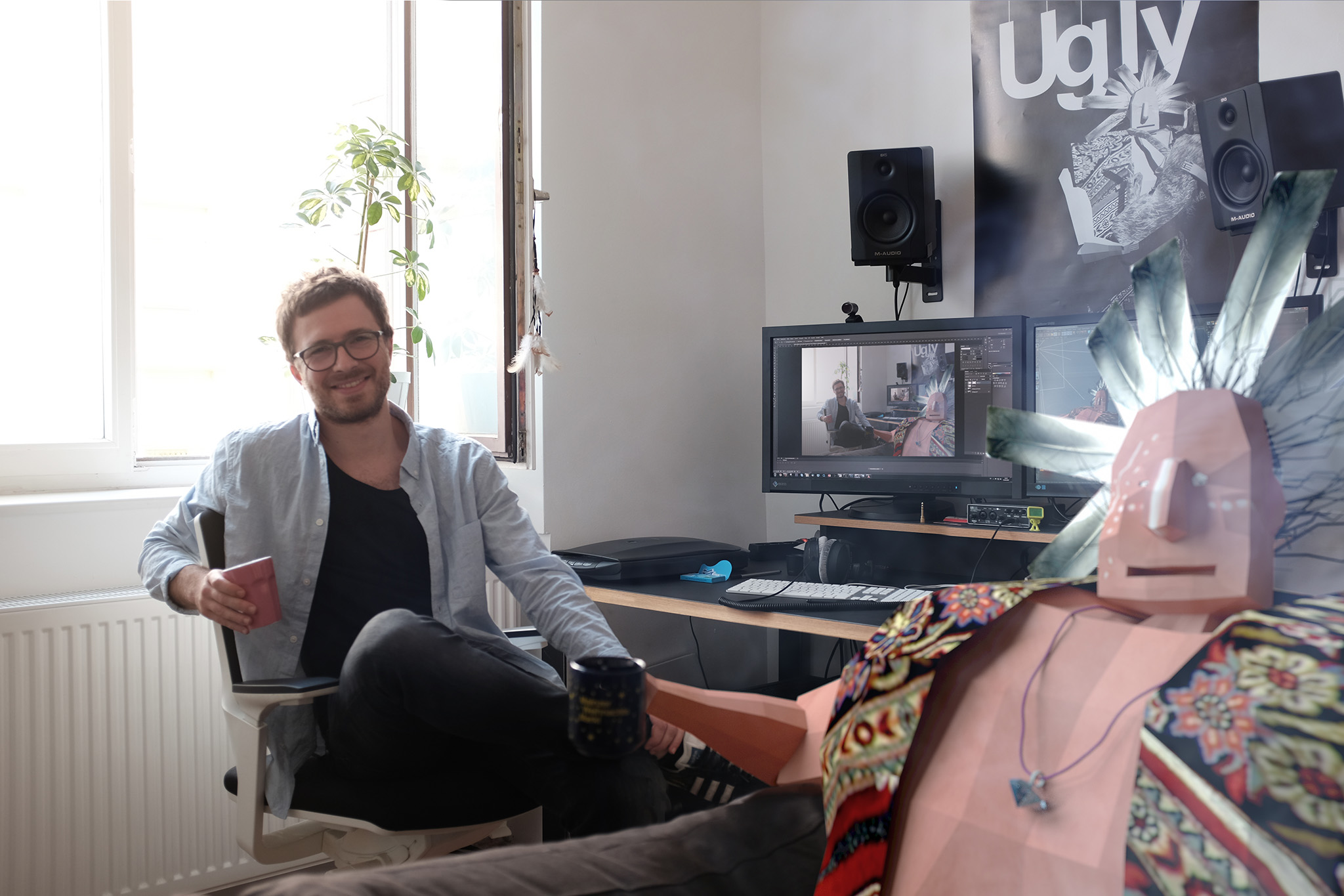
 ‘Ugly’ director and producer Nikita Diakur and Chief Redbear Easterman share a cup of coffee
CGI and Computer animation generally aim to produce the most polished and aesthetically pleasing results for the viewer, for obvious reasons. Enter Ugly, an experimental animated short that seemingly defies all rules and conventions of traditional animation, directed and produced by Russian-born filmmaker Nikita Diakur.
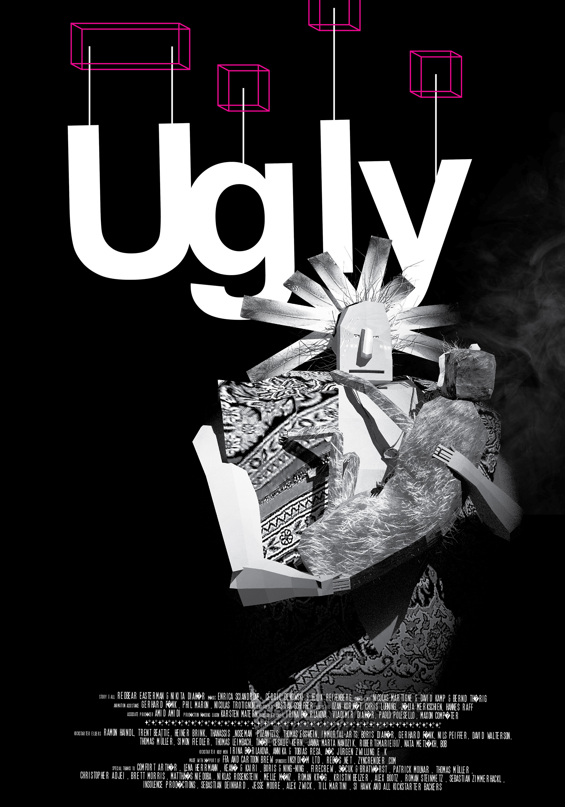
Exhibiting unique visuals and art direction bordering on the avant-garde, “Ugly” tells the story of a Native American chief and an ugly cat trying to find peace in a harsh environment. Having successfully received crowdfunding, the now finished short is about to hit this year’s festival circuit before its public release, starting with the prestigious Animafest Zagreb.
We had the chance to talk to Nikita about ‘Ugly’, the creative vision behind it and the experimental approach his team took in animating.
Hi Nikita, thank you for taking the time to do this interview. First of all, I'd like to congratulate you and your team on finishing ‘Ugly’! To start off, can you please briefly recount the process of working on the film these past years?
It took about 2 years to come up with the rough idea and around 4 years overall until the film was finished. There was no sudden lightbulb moment - like when there is an idea and you instantly know exactly what you are going to do and then go do it. It was more of a dynamic process and many good things happened over time via experimentation, problem-solving and learning from (as well as occasionally incorporating) mistakes.
From its name, the character design to the wonky animation: Visually, ‘Ugly’ seems like a deliberate aesthetic counterpoint to today’s industry standards. How and why did you make the artistic choice to forgo conventional CG eye candy in favor of a more unique style?
Unless you're an extremely dedicated technical genius you can't really compete with big studios when it comes to eye candy photorealistic stuff. We decided to focus on other things. For us, it was to make the movie as ugly as possible while still maintaining visual appeal. It was difficult to strike that balance and it took some time to find the right look. We made many decisions to save time, like texturing with camera projection for example. We figured that it actually fits the story perfectly if the projection only works from one side and is broken on the other.
Let’s talk about animating ‘Ugly’ in more detail. You’ve just mentioned how the animation varies between physically accurate and broken. How did this come about, was it a conscious decision from the start?
In the beginning, we were planning to animate with bad linear keyframing, similar to the YouTube clip „Animation Showreel (Possibly the "best" ever) “. This clip is genius because although it’s obviously bad, you can't immediately figure out if it was on purpose or not – it's very funny, especially if you’re an animator.
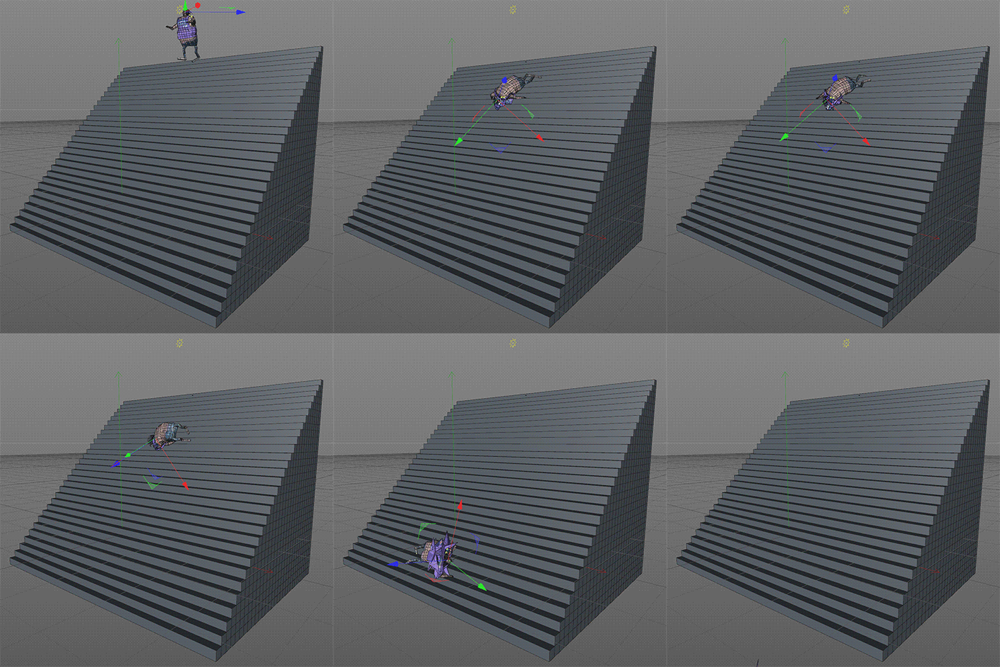
I was just about to start animating, but then I stumbled upon a video of a ragdoll falling down a staircase. I started thinking we might save even more time if we simulated everything. So I made a ragdoll in Cinema 4D, put it on top of a staircase and let it fall. The animation was far different from the original: The character got stuck shaking in the middle of the stairs, trying to solve the simulation. After a while, he exploded into the air and dropped. I felt that it was realistic and broken at the same time, which again complements the themes of the movie very well: realistic and broken – beautiful and ugly.

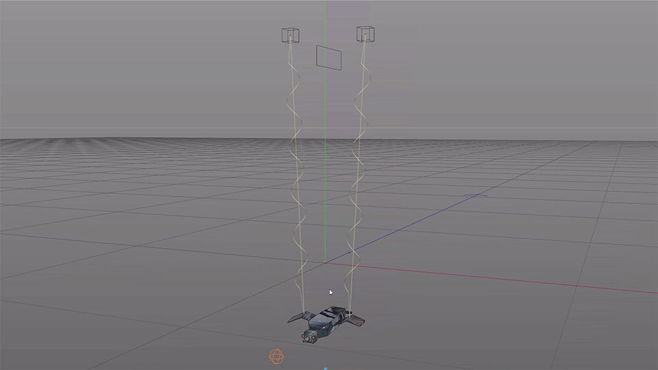
That's how the animation with marionettes started. The animation in ‘Ugly’ was always all about the balance between staying in control and leaving enough room for randomness.
 ‘Ugly’ character model with puppet strings
How did this decision to incorporate an element of chance into the equation influence the art direction overall? Were there ever unexpected outcomes?
There were a lot of unexpected outcomes, more in the beginning than towards the end. These were mostly due to the physical engine still not being accurate enough and rarely because of software bugs. Most of the time it was the animator's fault though, like when I forgot to bake parts of the simulation or when working with too low simulation sampling. The more problems we had, the more we learned how to use them to our advantage for the final film.
Sounds intriguing, can you give us an example?
We made this giraffe puppet running in half gravity, but forgot to delete a keyframe on one of the connectors. Suddenly one leg fell off, but the giraffe just kept on running and tripping. In the end, the whole rig exploded and we ended up using the animation in the film. We later deliberately used the same “error” when animating the roaring lion.
Generally speaking, how important is experimentation for you as part of the creative process as a whole?
Very important! Otherwise, things grow stale and boring eventually. You'll never evolve or move forward artistically unless you step out of your comfort zone and find out what is and isn't possible.
We're proud that you used our services when it came to rendering ‘Ugly’. What was your experience in using RebusFarm like?
I was very happy with the smooth integration in Cinema 4D. We had to render and rerender over 25.000 frames total, many of which went through RebusFarm. Overall it was comforting that we didn't have to worry about render time and could focus on other areas instead.
Now that production has finished, what are the next steps in releasing the film to a wider audience? How excited are you to finally share your work publically?
Right now we're in the process of submitting ‘Ugly’ to festivals. Since most of them have strict rules regarding public release, we, unfortunately, have to push back the online launch. ‘Ugly’ has been such a big part of my routine these last four years, I’m a little scared of falling into a deep dark hole now that everything is done.
We at RebusFarm wish Nikita all the best in the future and can hardly wait to find out about his next project. You can find more videos documenting ‘Ugly’s unique animation process on Nikita’s Vimeo channel. Be sure to stay on the lookout for the online release coming soon and catch the film in all its broken glory!

